You have all of your content ready for your big presentation – graphs, stats and more. So how do you get your presentation noticed by the team? Keep your employees and co-workers engaged with your presentation thanks to these quick tips!
- Keep the colors simple – Use solid colored backgrounds for your slides, no need for a custom background. A strong palette can keep your presentation visually appealing. Refrain from using too many different colors. Stick to 3-5 different colors throughout your slides.
- Make it legible – Reading is fundamental! When creating your presentation, make sure people can actually read it. Font sizes are key to getting your message across. Keeping sizes large, about 30 pt size or larger, will allow team members to take notes and really see the information that you are sharing. Keep with the ‘Rule of 7’ for your presentation. There should not be more than seven lines of text and keep to seven words per line.
- Use visuals – Elements like bar graphs or photography and illustrations can draw attention to your presentation. When using visuals, make sure that they are high-quality files. Stay away from blurry photos. Test your slides out on the big screen before you present and make sure that everything looks crisp.
A few presentation bonus tips!
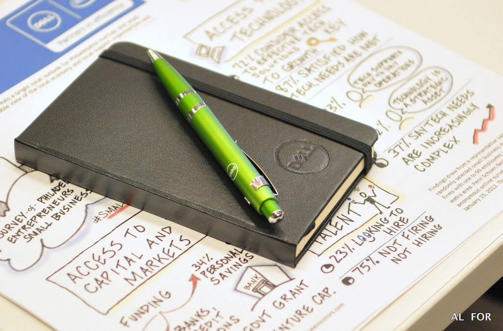
Infographics – Provide an infographic as a presentation handout. Allow your audience to follow along with your information in a fresh and visual way. Our team can help with creating these visuals for your presentation. Check out our services here!
Stay on time – While you may have a lot to share, watch the clock and keep it on time. There’s nothing worse than going over time when there are other presentations after you. Be respectful of your team’s time as well. This will also help keep them focused on what you have to say if you provide an expected timeframe for your content. You can also assign someone to be the timekeeper. This will be helpful to provide 10 and 2-minute warnings during the presentation.
Thanks for reading! If you find this valuable, please share this with someone you know.
Are you or maybe someone you know planning a conference? Keep the attendees engaged, they need to SEE the big picture. Just contact me for a free consultation. I’m happy to help (smile).
Lisa
Latest posts by Lisa (see all)
- Unlock Your Meeting’s Potential – Visual Notetaking Tip Sheet - August 2, 2024
- Press Release: See In Colors Awarded Project Restore Grant to Expand Business Operations - March 15, 2023
- The When, Why, and How of Planning Your Staff Retreat - July 14, 2022


